Mexico City Travel: Santa Fe, That Shiny Object
Driving from Mexico to Toluca earlier in the trip, I noticed the shiny mass of glass of Santa Fe. Then, once settled in the center of the city, I was curious to make my way westward to the affluent suburb of the city to see what it was all about.
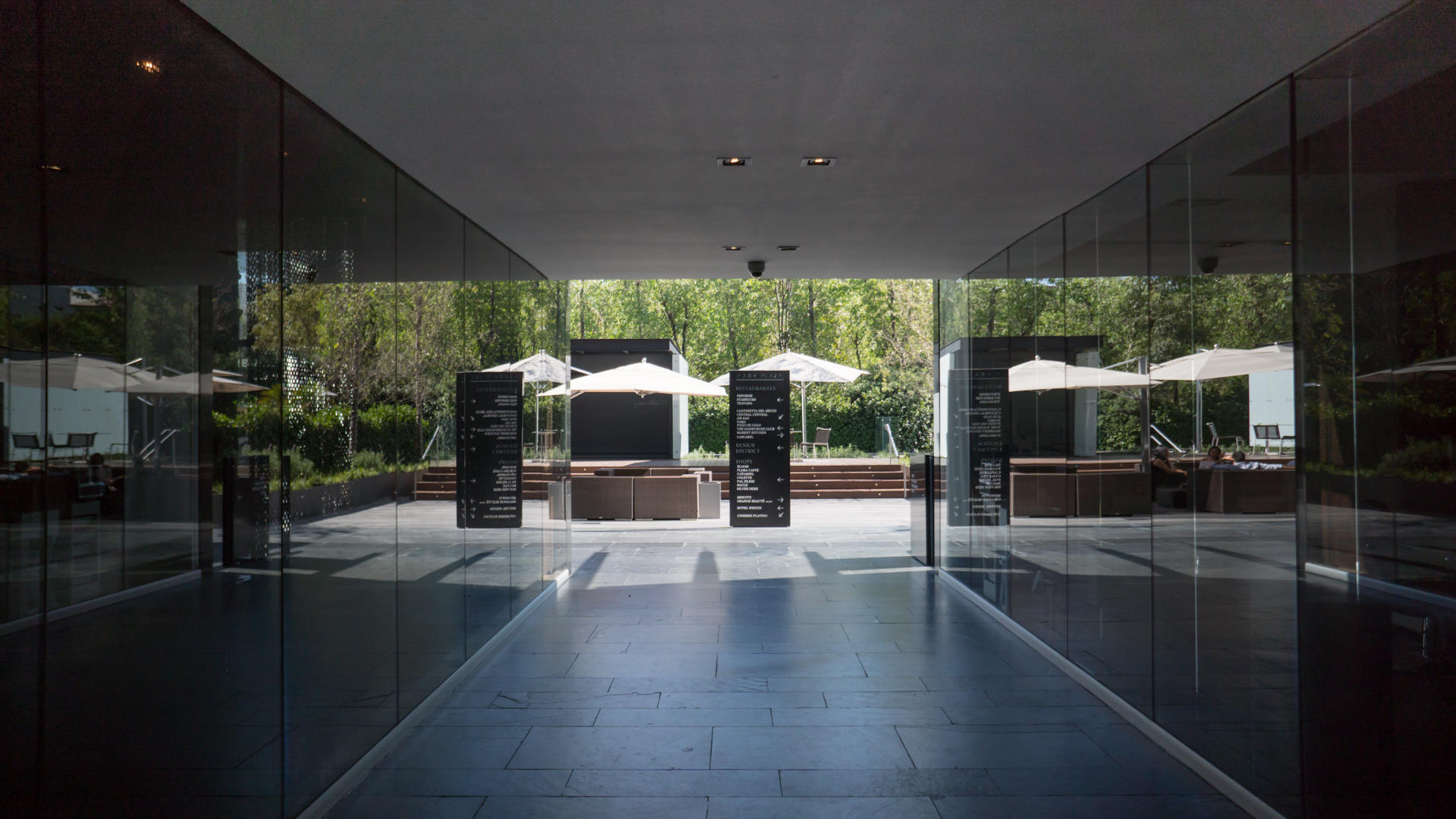
Getting off my Uber in Santa Fe (there is no metro station there yet), I walk around the Park Plaza before going to lunch at Market Kitchen (see my review over at Creative Days Co site here). The place feels a bit eerie with all the people gone for the holidays. In fact, I'm the only person at the one Monocle-loving store I visit as well as in the restaurant. Overall, the plaza is oddly forgettable if pretty.
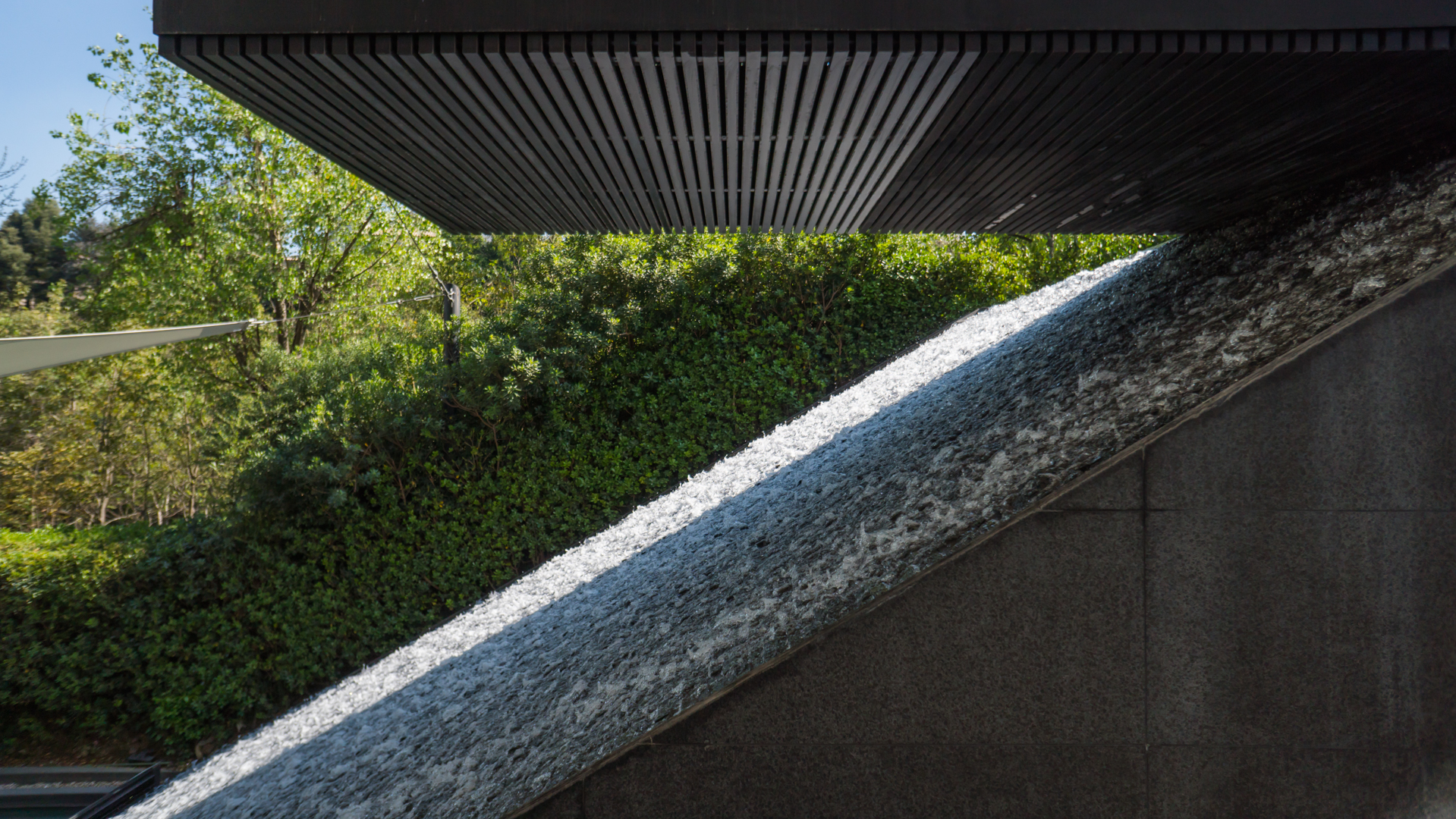
Following my meal, I walk for about two hours through shopping centers and streets, looking up at a collection of more or less interesting modern buildings. Here, hotel chains try to one-up each other with already-tired visual motifs (such as slightly wavy facades, circular volumes within rectangular masses, extraneous suspended structures connecting two masses, etc.). There isn't a whole lot going on here architecturally, and every one of those attempts at standing out seems to reinforce a sense of clean monotony.
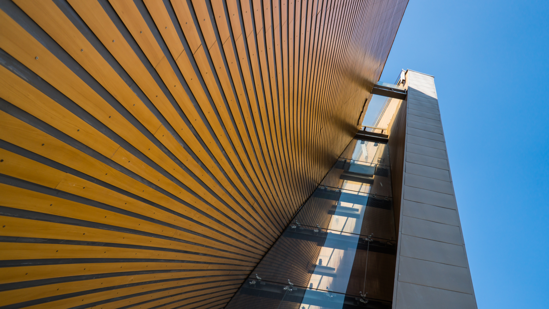
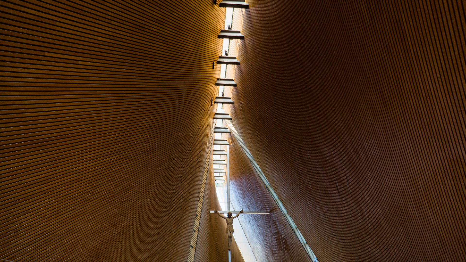
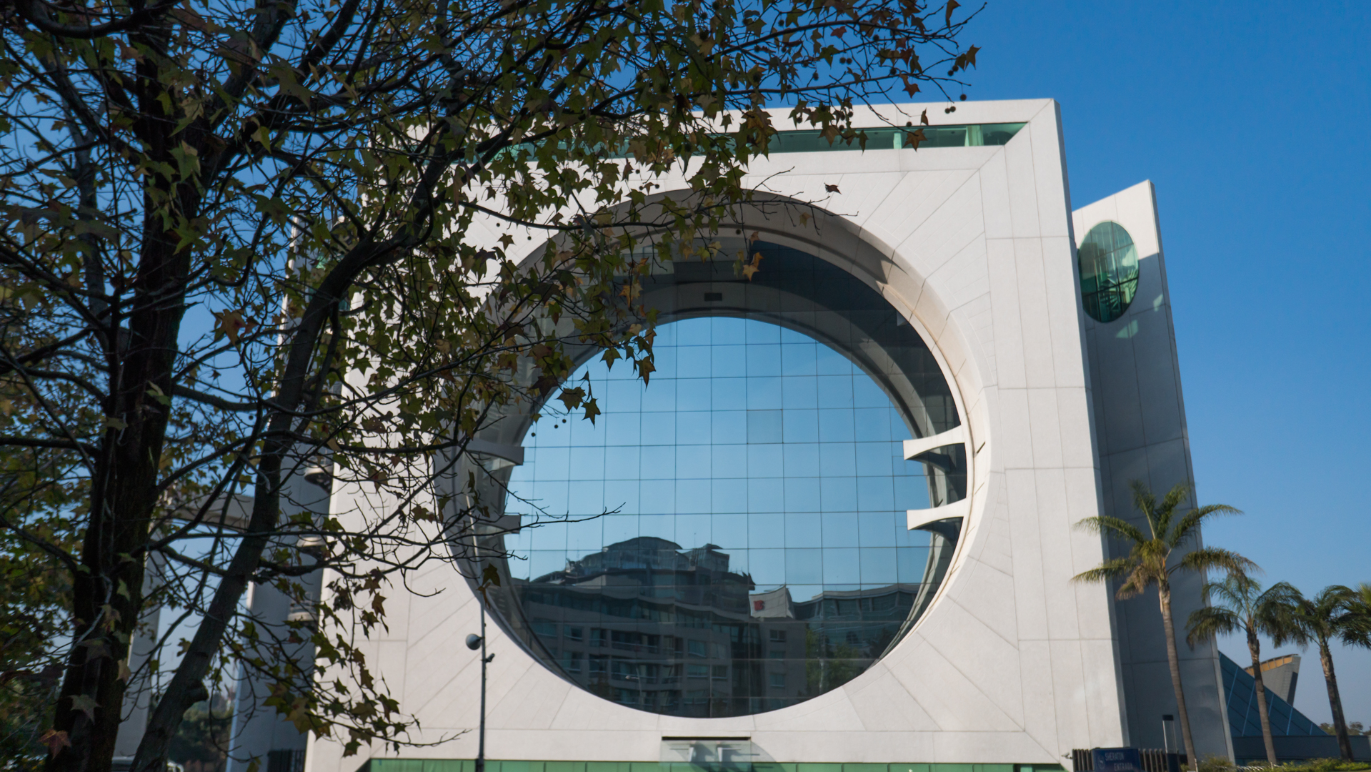
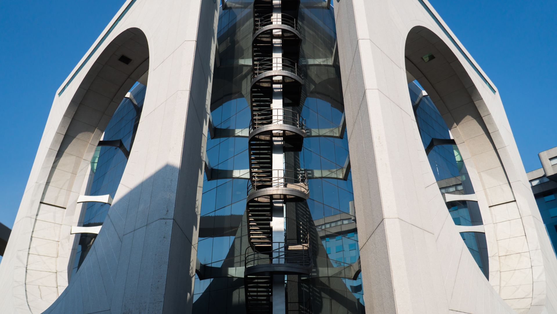
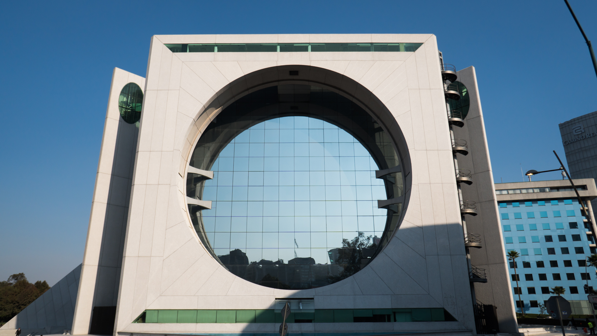
In my adventure, however, two buildings stand out: the Parroquia San Josemaría Escrivá and its neighbor, the Edificio Calakmul.
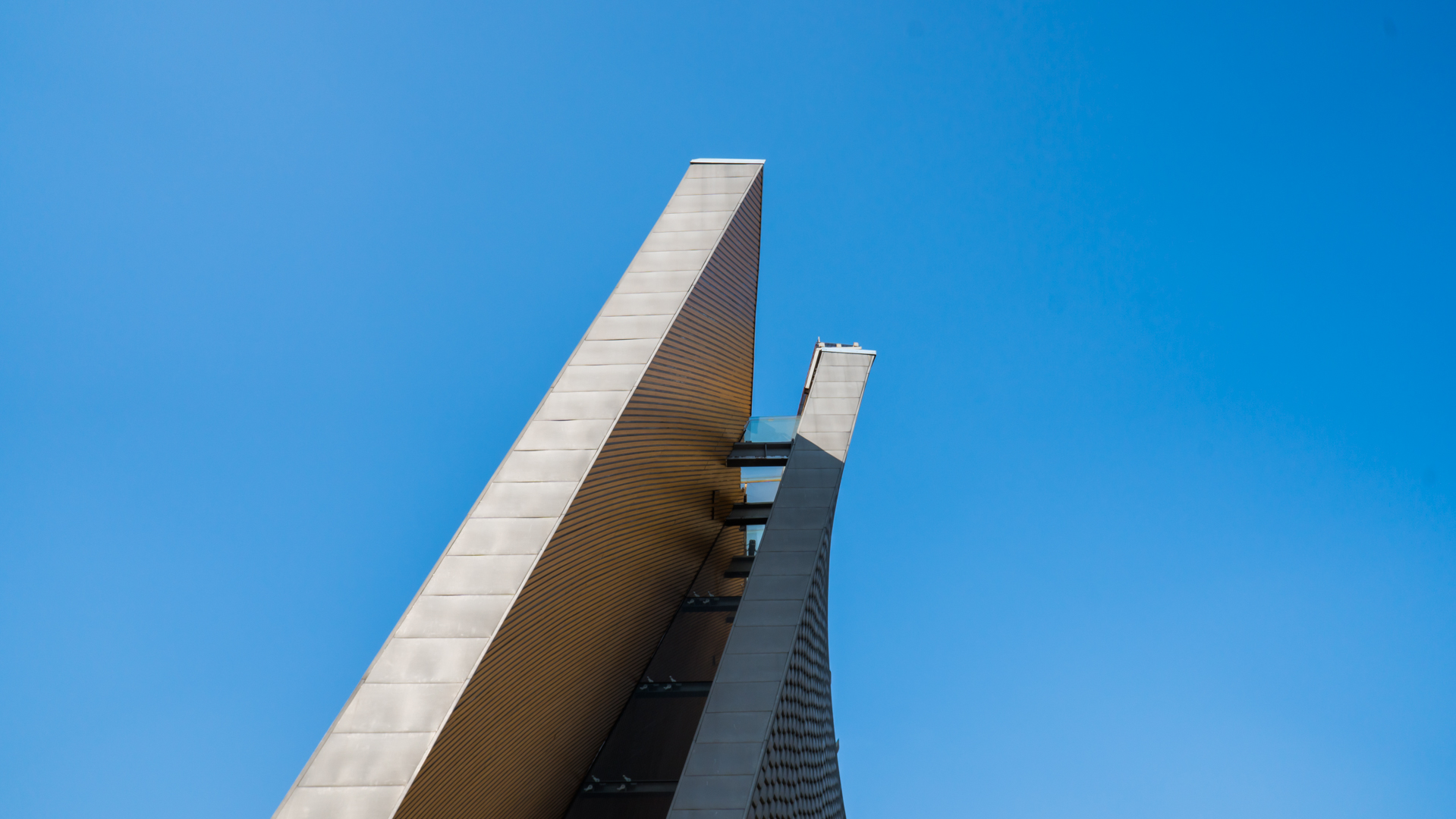
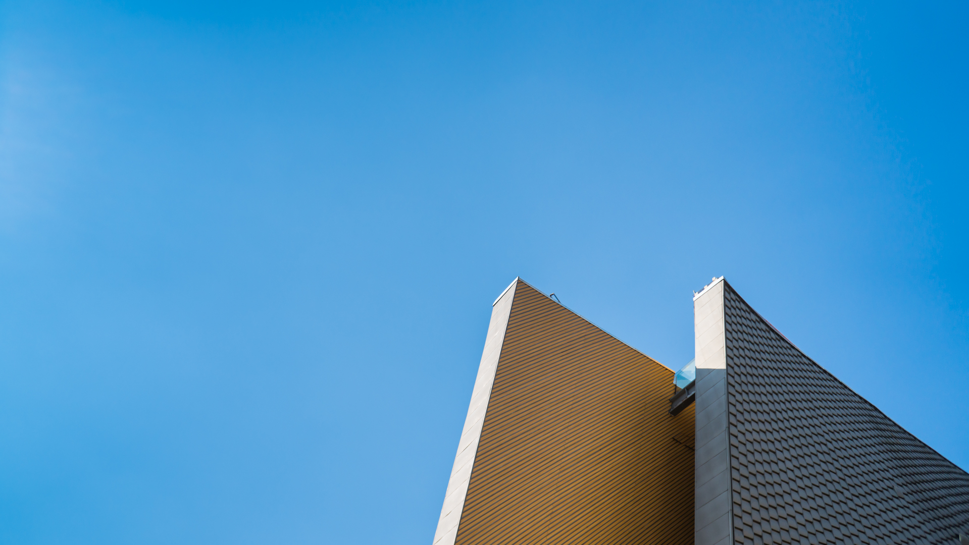
The stunningly modern church, opened in 2009, though perhaps not worth a visit on its own, certainly deserves a stop for anyone going over to see the rest of the area (the Universidad Iberoamericana is also of some notice). Featuring a duo of dramatically curved faces, the building is minimal and subdued, with an off-center Jesus-on-the-cross hanging against a vast tilted wooden ceiling. Overall, the inside is quietly moving, though less noteworthy than the outside structure might indicate.
Across the street, the Calakmul, a structure often highlighted in architectural guides of the area, is a creative and contemporary building. Essentially a large cube with oversized circular holes on each side, it seems to re-mix old brutalist architecture, successfully actualizing it for a new generation. The interaction between concrete and glass is forceful but somehow delicate, and the odd volume does not seem heavy on the site. The only downside is that access is highly limited and one cannot walk too close, let alone peacefully photography the structure (I was stopped by security within about two minutes and asked to stop snapping). Still, if you are a real architecture lover, it deserves a look.
Ultimately, Mexico City's Santa Fe might only be a mildly interesting place to visit on a busy day to see how rich Chilangos - and some students - spend their time comfortably outside the city core. However, I do want to emphasize that, contrary to what you might read elsewhere online, it is not a closed-off no man's land or a particularly depressing bastion of wealth. But it is what it is; nothing less, nothing more.
A quick note on this post: I do want to apologize for my limited understanding of Mexico City history and urban planning. The post below isn't a comprehensive guide to the Santa Fe area, but rather a collection of first impressions. I promise to revisit the neighborhood once I return to CDMX and try and delve more deeply into why it is what it is, and how it fits into the urban fabric of the city. Thanks for your understanding.

